Fitness app for personal trainers and their clients
A dual-sided fitness app for personal trainers and their clients: planning, progress tracking, a 1,300-exercise library and chat, all in one place.
- Client
- Confidential (NDA)
- Role
- Lead Product Designer
- Industry
- Fitness & Training
- Platform
- Mobile app
- Year
- 2025
- Status
- Shipped
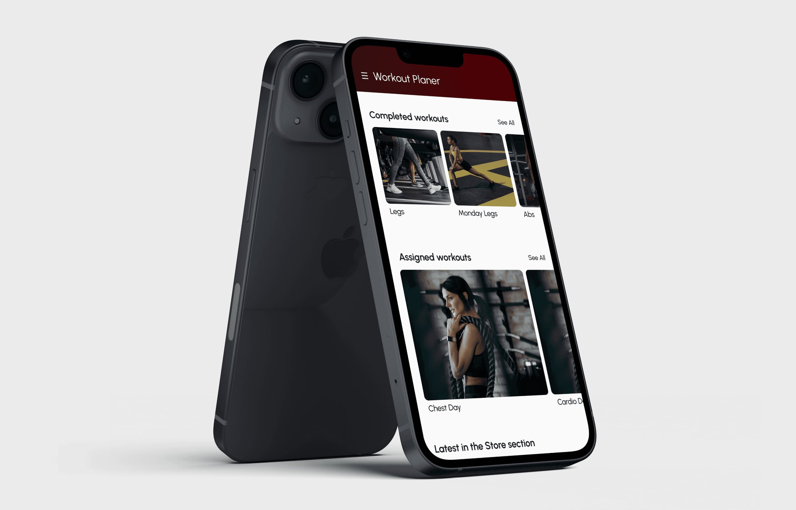
At a glance
Scope
- User research
- UX maps & flows
- Design system
- Light & dark UI
Problem
Trainers juggle clients, custom plans, progress and messages across tools that are either bloated or too basic.
Approach
One app, two clearly separated roles: control and overview for trainers, simplicity and motivation for clients.
Shipped
Built and released end to end, backed by a design system that carries full light and dark themes.
01
Challenge
Fitness apps live at two extremes: so packed with features they overwhelm you, or so stripped back they're useless for anyone serious about training.
Neither works for personal trainers, whose needs are very different from casual users. They manage several clients, build and send custom plans, track progress across different people and stay in touch, all from their phone, on the go.
No existing tool did all of that in one simple place.
02
Solution
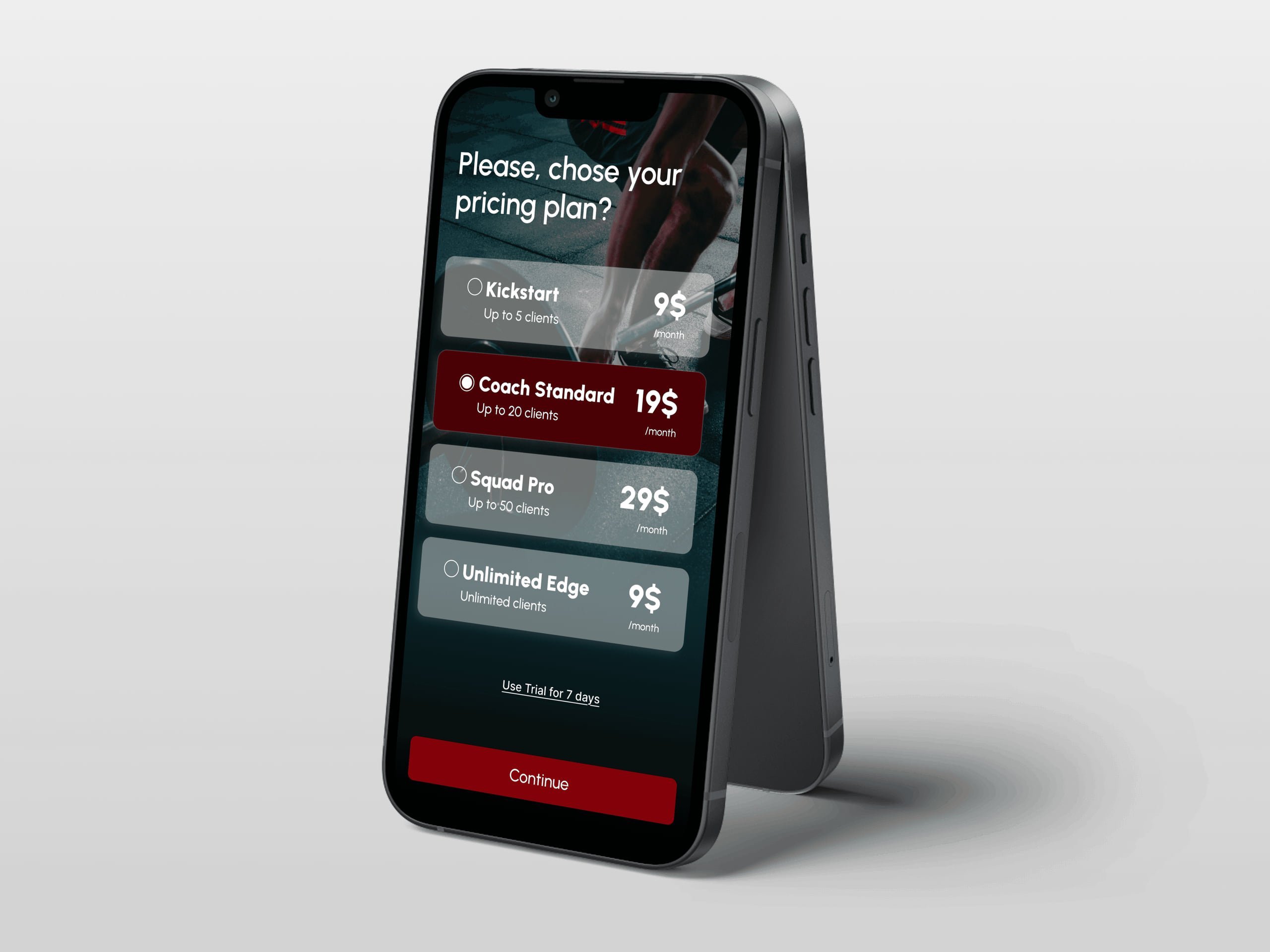
One app, serving trainers and their clients in the same ecosystem.
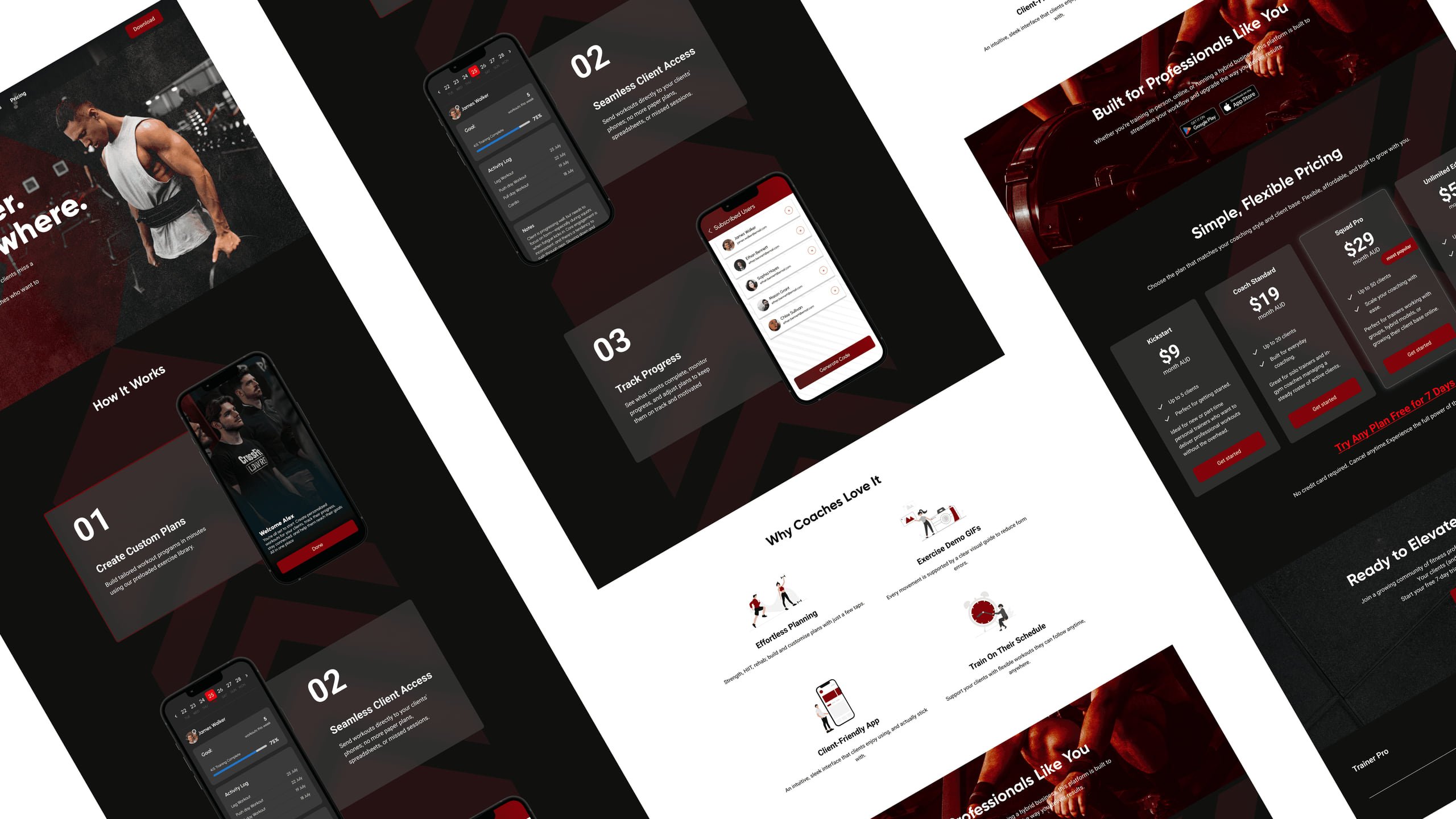
Trainers get a full toolkit: a weekly planner to build and assign workouts, a client overview to track everyone's progress at a glance, and built-in chat so they're reachable without a separate app. Clients get their plans, a library of over 1,300 exercises and a direct line to their trainer.
The core idea was simple: everything a trainer needs to run their business, and everything a client needs to train well. Nothing more, nothing less.
03
What I delivered
I led the design end to end, from research to the final UI in light and dark themes.
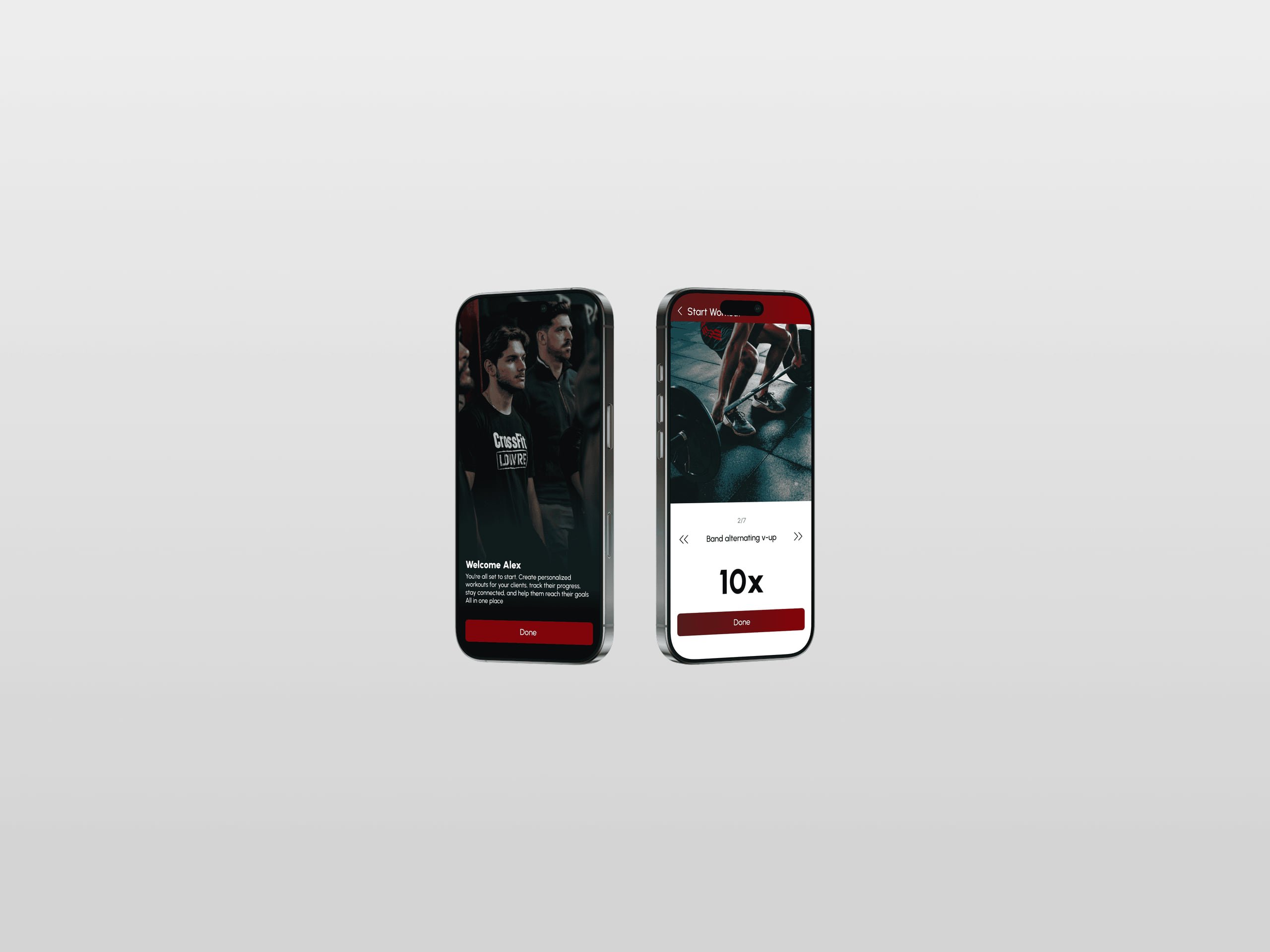
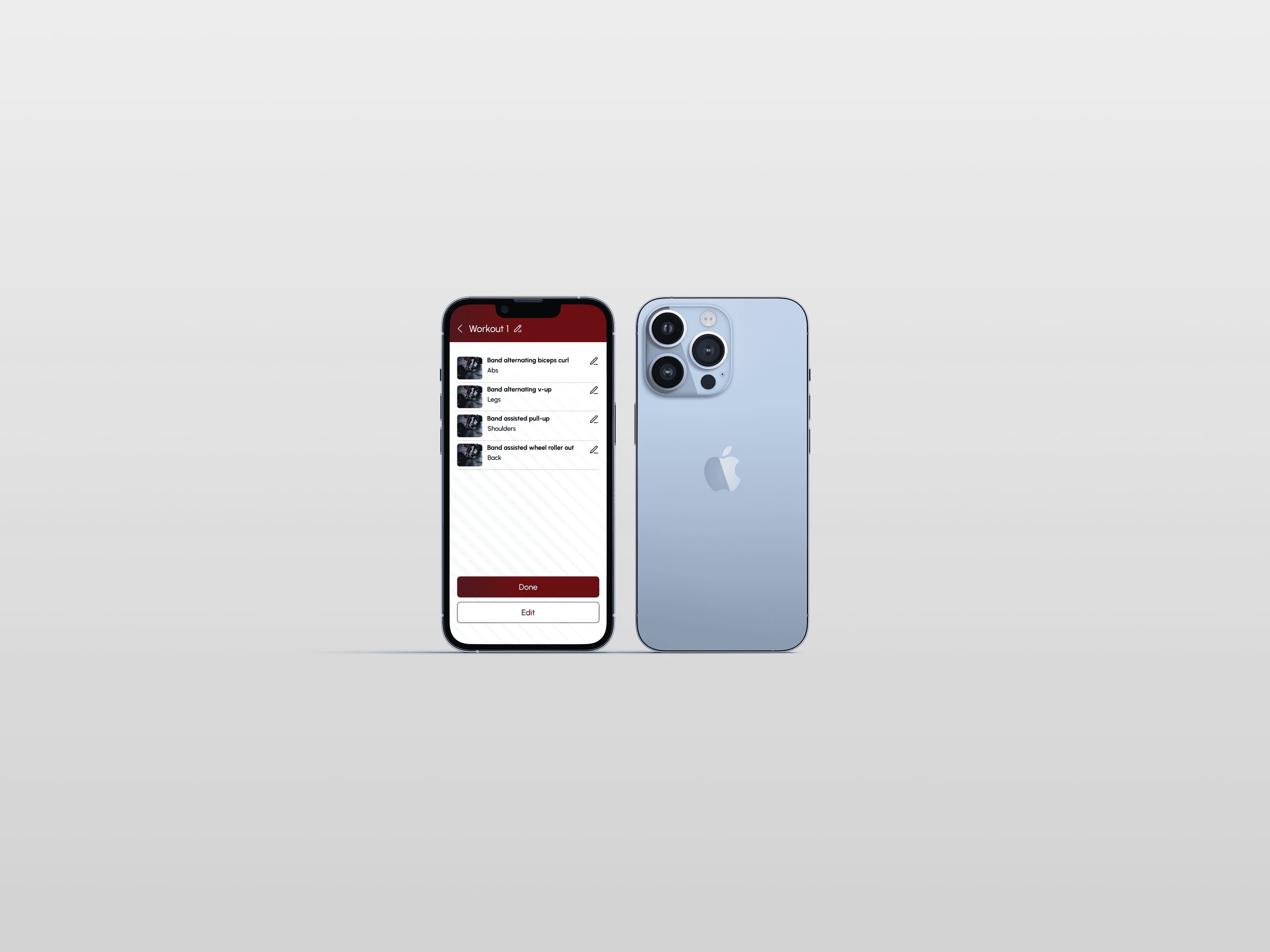
User research, user roles, UX maps, flows, wireframes, a design system, a component library and the final mobile UI. Every screen went through my hands: onboarding, the weekly planner, progress tracking, the exercise library, chat and client management.
I worked directly with the developer throughout, making sure every decision was buildable and the handoff was clean.
- Exercises in a searchable, filterable library
- 1,300+
- Roles in one app: trainer and client
- 2
- Complete themes, light and dark
- 2
04
Key design decisions
- 04.1
Two users, one app, clear role separation
Designing for trainers and clients in the same app needed clear role separation from the start. The trainer side is built around control and overview: see all clients, send plans, track progress, stay reachable. The client side is built around simplicity and motivation: open the app, see your plan, get to work.
- 04.2
A weekly planner that's fast and repeatable
Trainers build plans constantly, for many clients, often with similar structures but different details. The planner had to make that fast and repeatable without feeling repetitive or clunky.
- 04.3
A 1,300-exercise library that stays usable
A database that size can easily become unusable. The right filters, categories and search are built into the UI, so it feels easy to navigate instead of overwhelming. It was one of the harder problems, and I spent a lot of time on it.
- 04.4
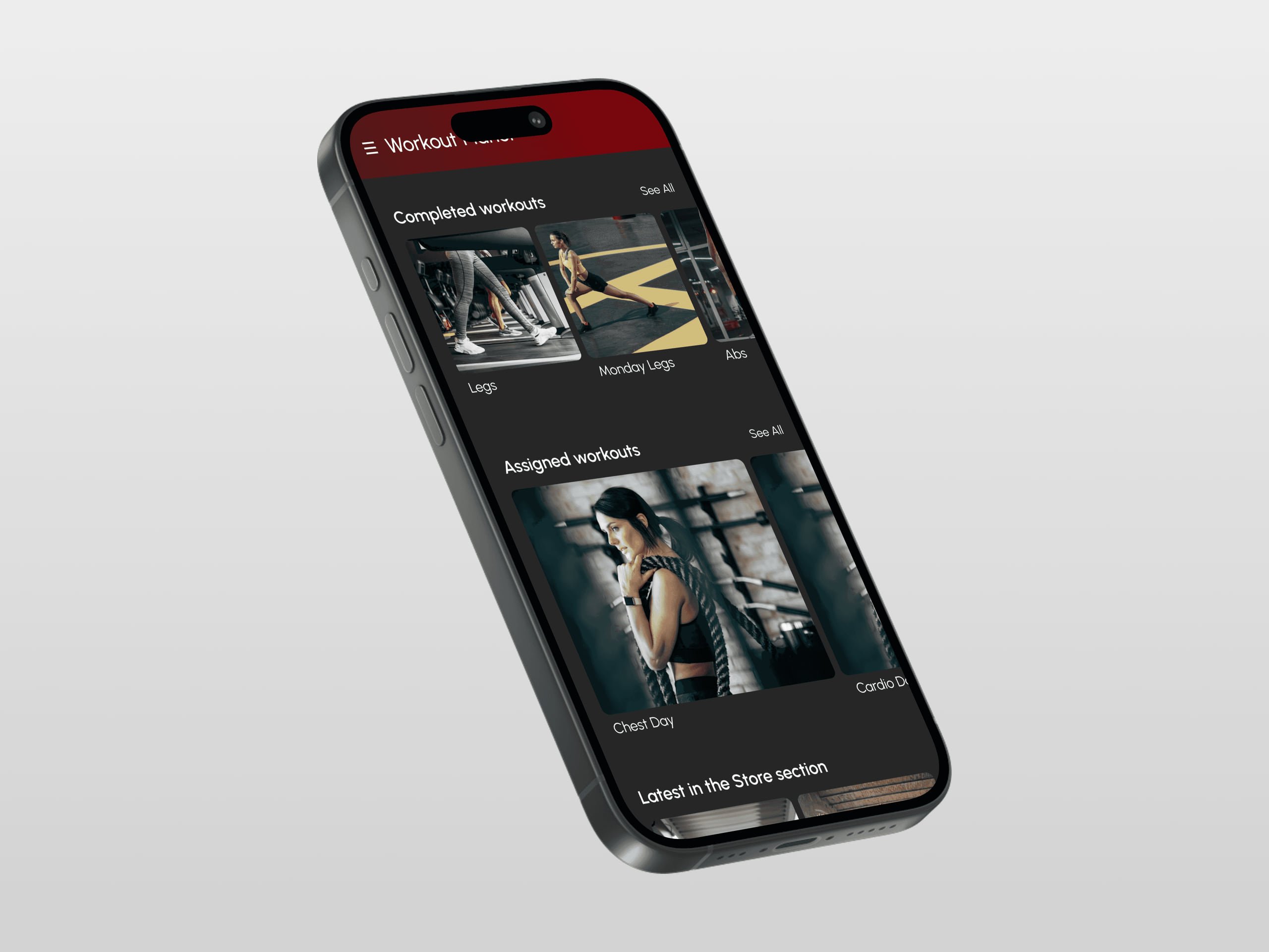
Light and dark themes, done properly
I'm especially proud of the light and dark themes. Not as a visual feature, but as proof that the design system was built properly from the ground up to support both without compromise.
05
Shipped and complete
This was the most complete project I've worked on. It went from research all the way to a fully shipped mobile app, backed by a design system solid enough to support light and dark themes without compromise.