Blockchain infrastructure website
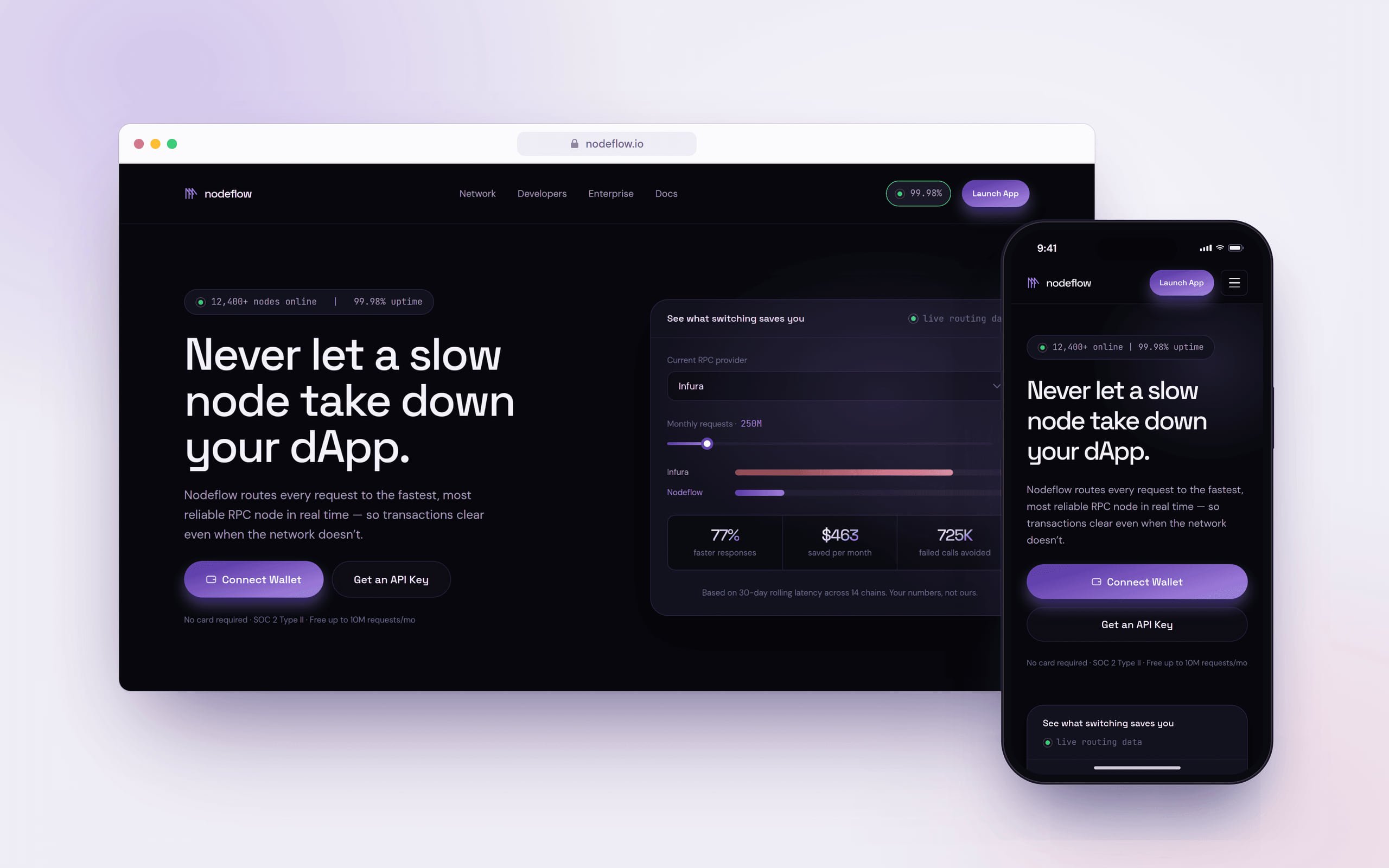
A landing page concept for an RPC infrastructure platform, designed to make a highly technical product clear, credible and relevant to both developers and enterprise teams.
- Client
- Product design challenge
- Role
- Product & Web Designer
- Industry
- Web3 infrastructure
- Platform
- Website
- Year
- 2026
- Status
- Concept
At a glance
Scope
- Competitive research
- Positioning & IA
- Interactive calculator
- Visual system
Problem
Blockchain infrastructure is hard to explain without getting too technical or sounding like every other Web3 site.
Approach
Prove the value before explaining the technology: real signals first, technical depth when users are ready.
Delivered
A high-fidelity concept: one narrative for developers and enterprise buyers, plus a visual system.
01
Challenge
Blockchain infrastructure is difficult to explain without becoming too technical, or falling into the visual and marketing clichés of the Web3 industry.
Nodeflow also had to speak to two very different audiences. Developers care about speed, latency, integration, network coverage and how quickly they can start building. Enterprise teams care about reliability, security, SLAs, infrastructure risk and support.
The challenge wasn't simply designing a modern website. It was creating one clear story that could convince both audiences without the experience feeling fragmented or overloaded.
02
Solution
I designed the homepage around one principle: prove the value before asking people to understand the technology.
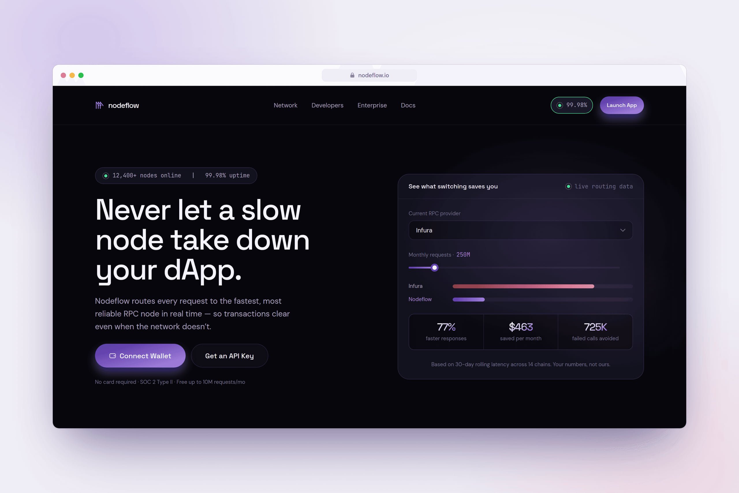
Instead of opening with long explanations of RPC infrastructure, the page introduces real product signals early: network uptime, latency, supported chains, node availability and an interactive savings calculator.
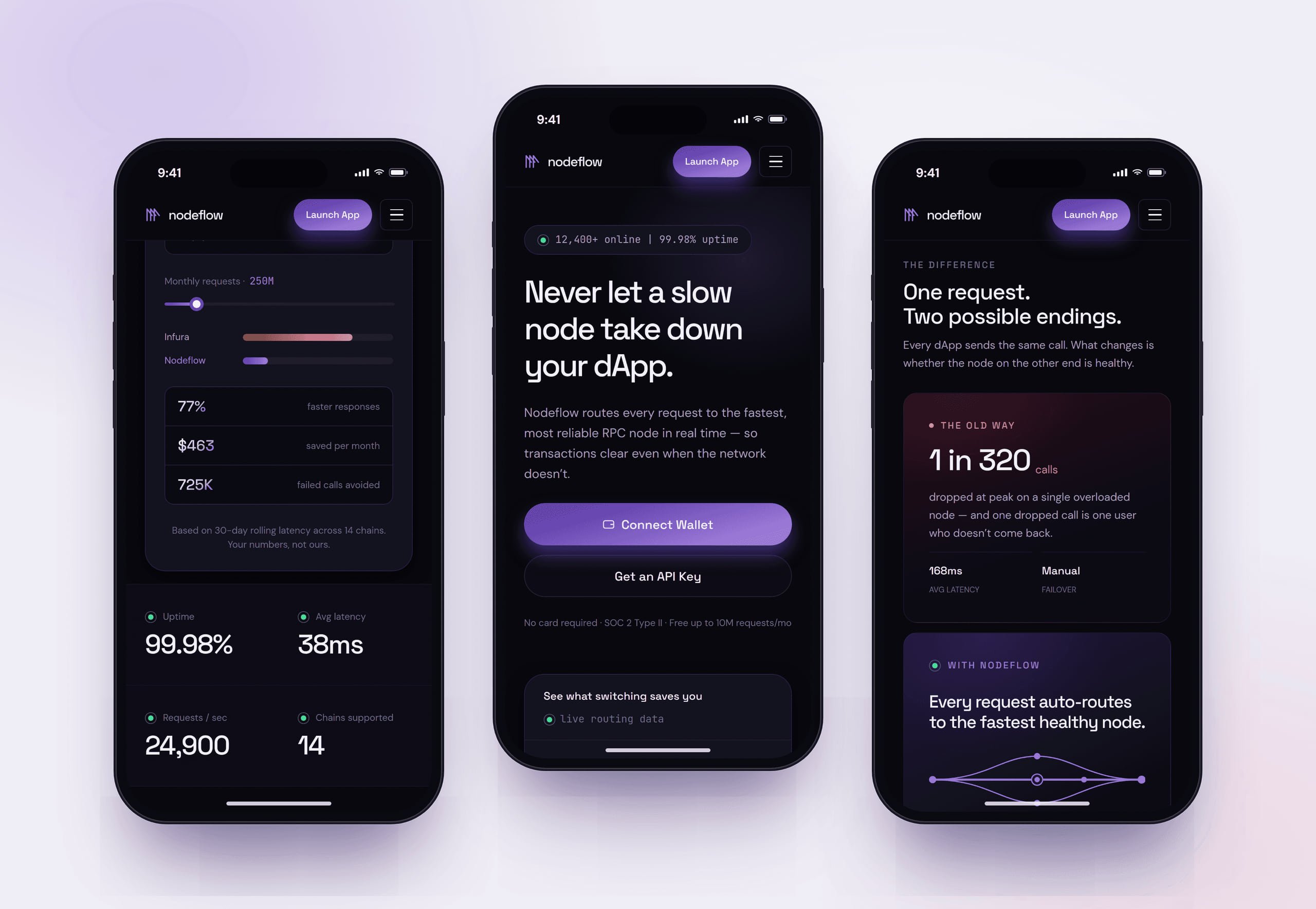
From there, the story moves gradually deeper: the problem with traditional RPC infrastructure, how Nodeflow improves routing, the core capabilities, developer integration, and finally enterprise reliability and support. Outcomes and proof first; technical detail when users are ready for it.
03
What I delivered
I took the project from research and positioning to a high-fidelity website concept.
I reviewed competitors in the blockchain infrastructure space, mapped how they communicated technical value, structured the information architecture and content hierarchy, and designed the full desktop experience.
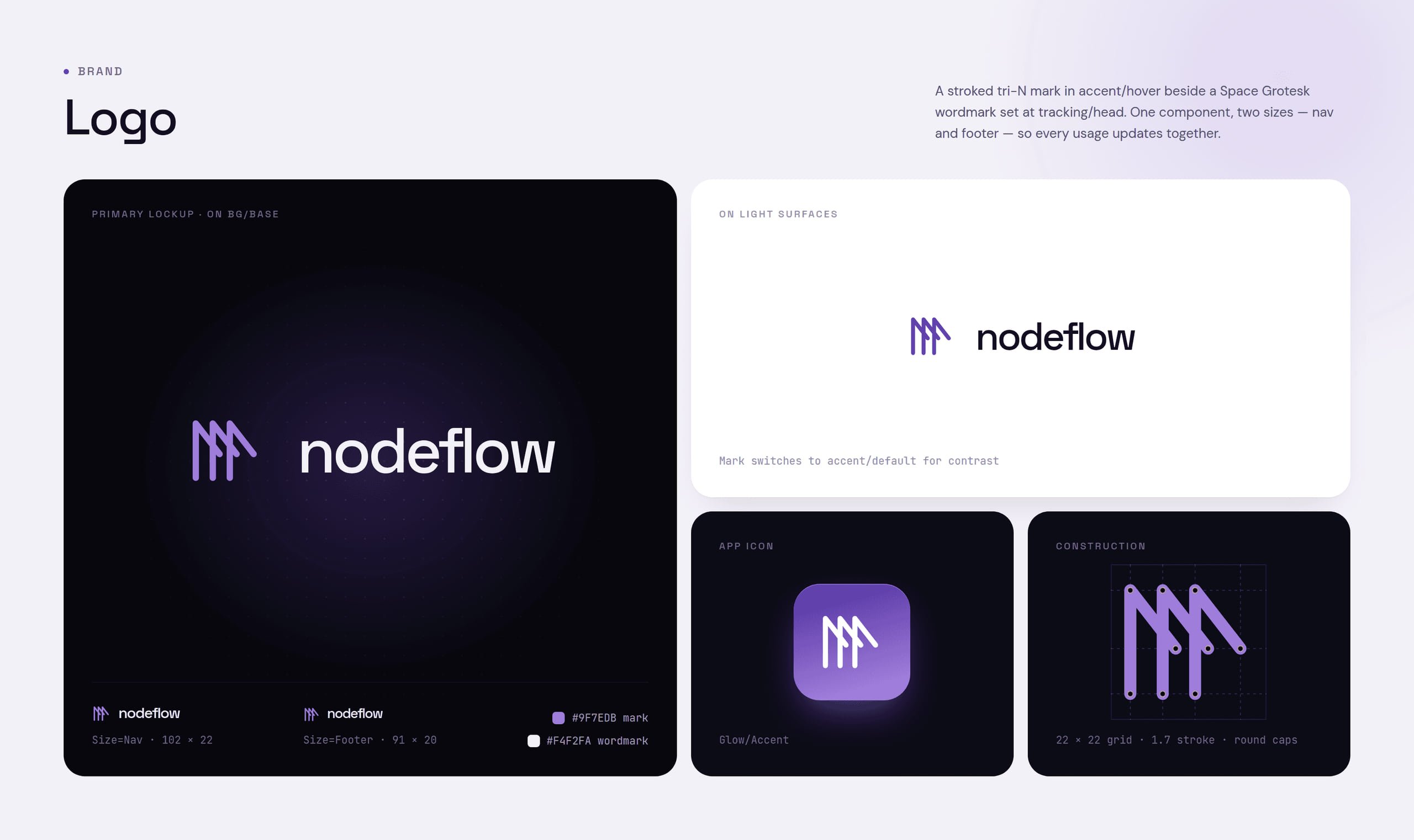
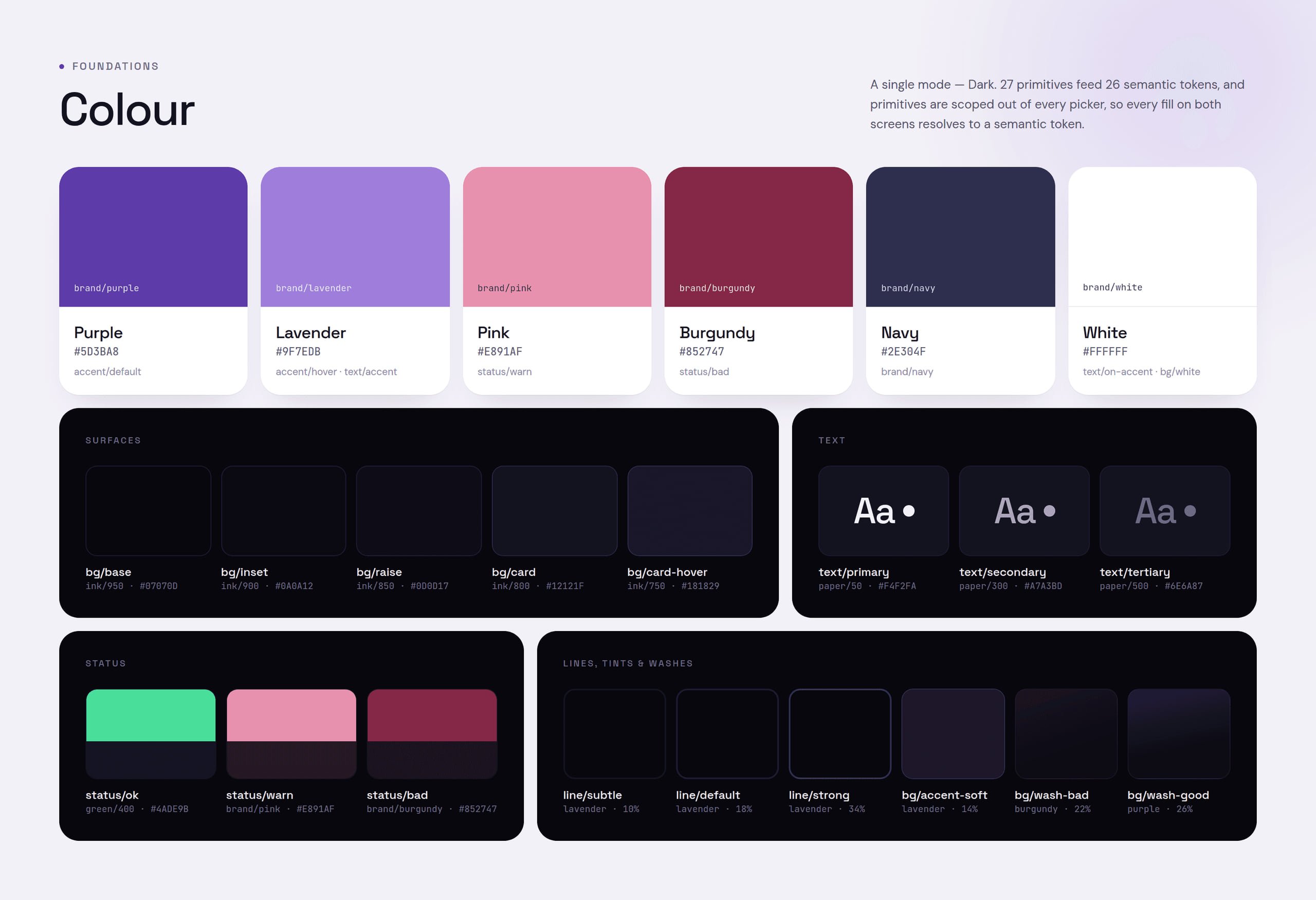
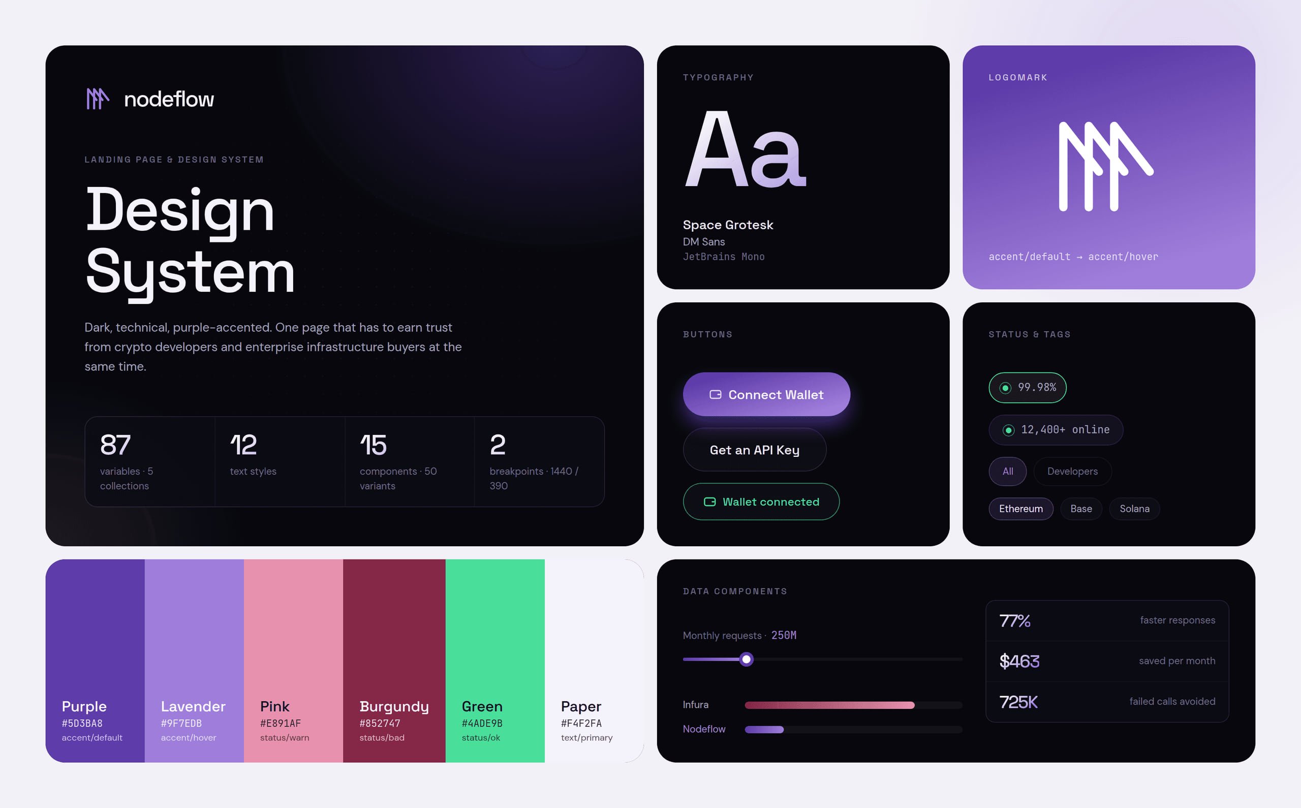
I also created an interactive calculator concept, live network status components, developer-focused interface elements, product diagrams and a visual system built on a dark, technical aesthetic. It's designed to feel like serious infrastructure software rather than another crypto marketing site.
04
Key design decisions
- 04.1
Two audiences, one story
Developers and enterprise buyers care about different things, but splitting them too early would make the site feel like two products stitched together. Instead, I built one shared narrative around performance and reliability. Early sections communicate benefits everyone understands; later sections get specific: integration for developers, and security, SLAs and support for enterprise teams.
- 04.2
Credibility before explanation
Infrastructure products often spend too long explaining how they work before giving anyone a reason to care. I reversed that order. Operational metrics, network status, supported chains and social proof appear near the top, answering the first question immediately: “Can I trust this infrastructure?” Only then does the page explain how Nodeflow works.
- 04.3
Making performance tangible
Claims like “faster” and “more reliable” are easy to ignore because every competitor makes them. The interactive calculator turns them into something users can explore: pick your current RPC provider and monthly request volume, and see estimated latency improvements and potential monthly savings. In other words, what switching could mean for your own product.
- 04.4
Technical, without looking like crypto
I deliberately avoided the visual language of crypto websites: heavy gradients, glowing coins, abstract 3D objects and visual noise. The direction uses a near-black interface, controlled purple and pink accents, subtle network graphics, clear typography, terminal-inspired developer elements and real product metrics.
05
What the concept shows
The concept builds the homepage around three layers of proof: measurable performance, an interactive demonstration of value and technical credibility. It shows how a complex infrastructure product can speak to developers and enterprise decision-makers in the same experience without overwhelming either.
It also pushed me beyond UI execution. Much of the work was deciding what users needed to understand first, what could wait, and how the order of information could make a technical product easier to trust.