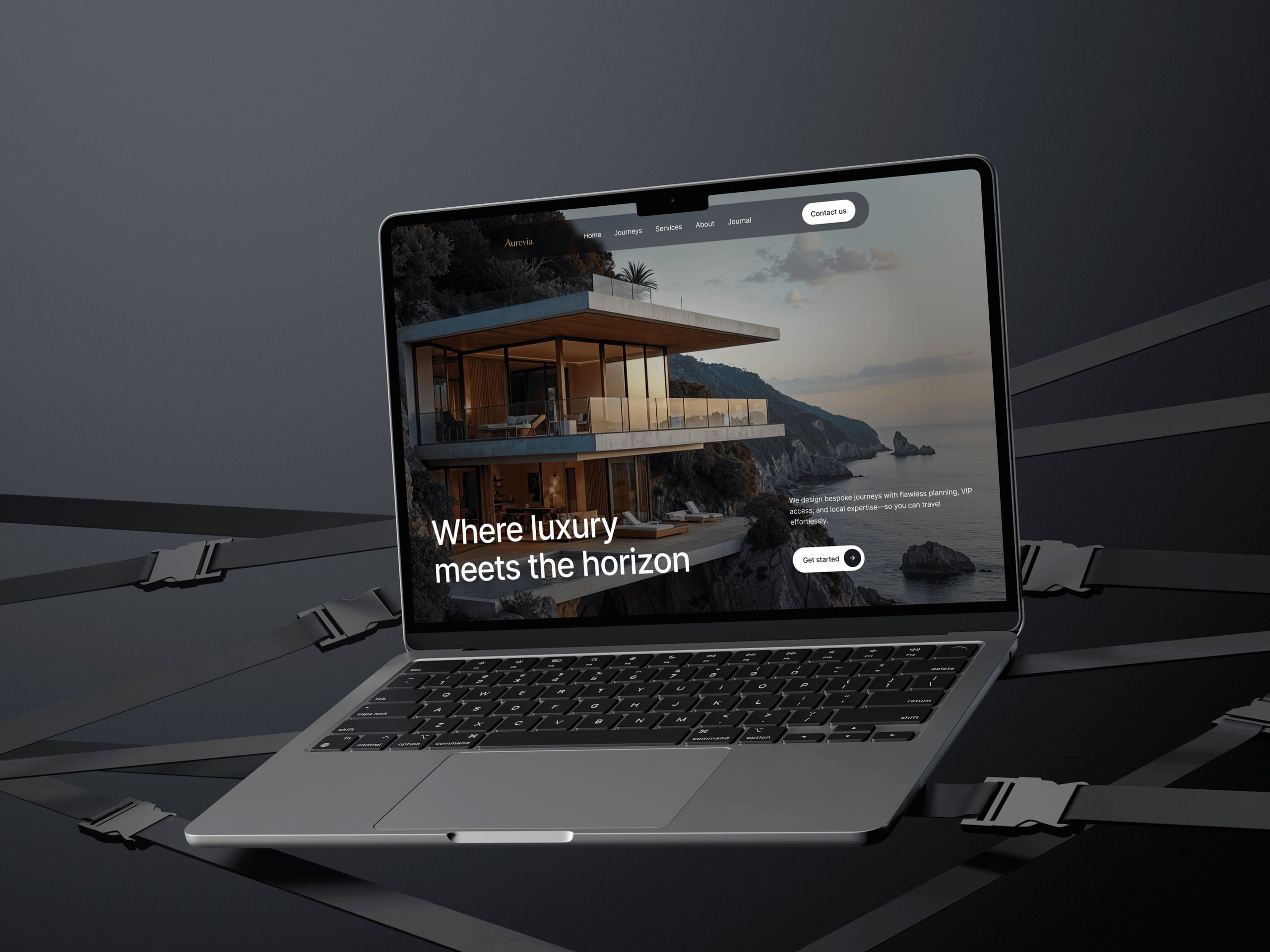
Solar energy website
A landing page for a solar energy brand, designed to make going solar feel simple, trustworthy and worth doing.
- Client
- Personal project
- Role
- Product & Web Designer
- Industry
- Eco & Sustainability
- Platform
- Website
- Year
- 2026
- Status
- Concept
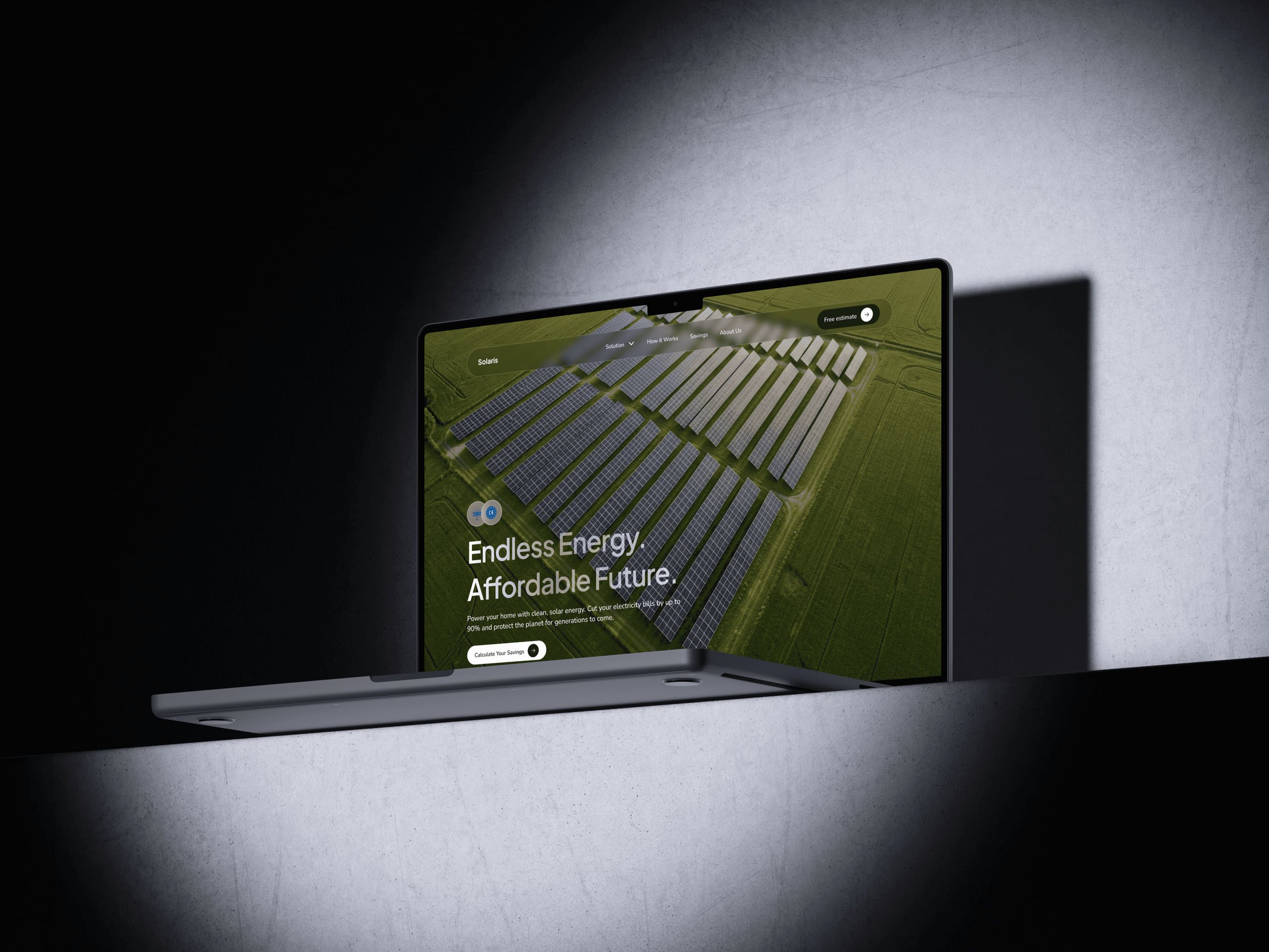
At a glance
Scope
- Landing page
- Data visualisation
- Onboarding flow
- Visual design
Idea
A project built around a cause I care about and use myself.
Problem
Solar works and the savings are real, but most brands lead with specs that overwhelm.
Solution
A clean, open page where every section earns its place and savings read at a glance.
01
The idea
Solaris was personal in a way most of my projects aren't. I care about renewable energy. I follow it, support it and use it myself.
So adding an eco project to my portfolio was more than a design exercise. I wanted to build something around a cause I believe in, and show how good design can make sustainable energy feel less like a sacrifice and more like an obvious choice.
02
Challenge
Solar energy has an image problem.
The technology works, the savings are real and the environmental case is clear, yet many people still find it complicated or overwhelming to even consider.
A big part of that is communication. Too many solar brands lead with technical specs and numbers, when what most people need is to feel that this is simple, trustworthy and worth doing. The design challenge was to close that gap.
03
Solution
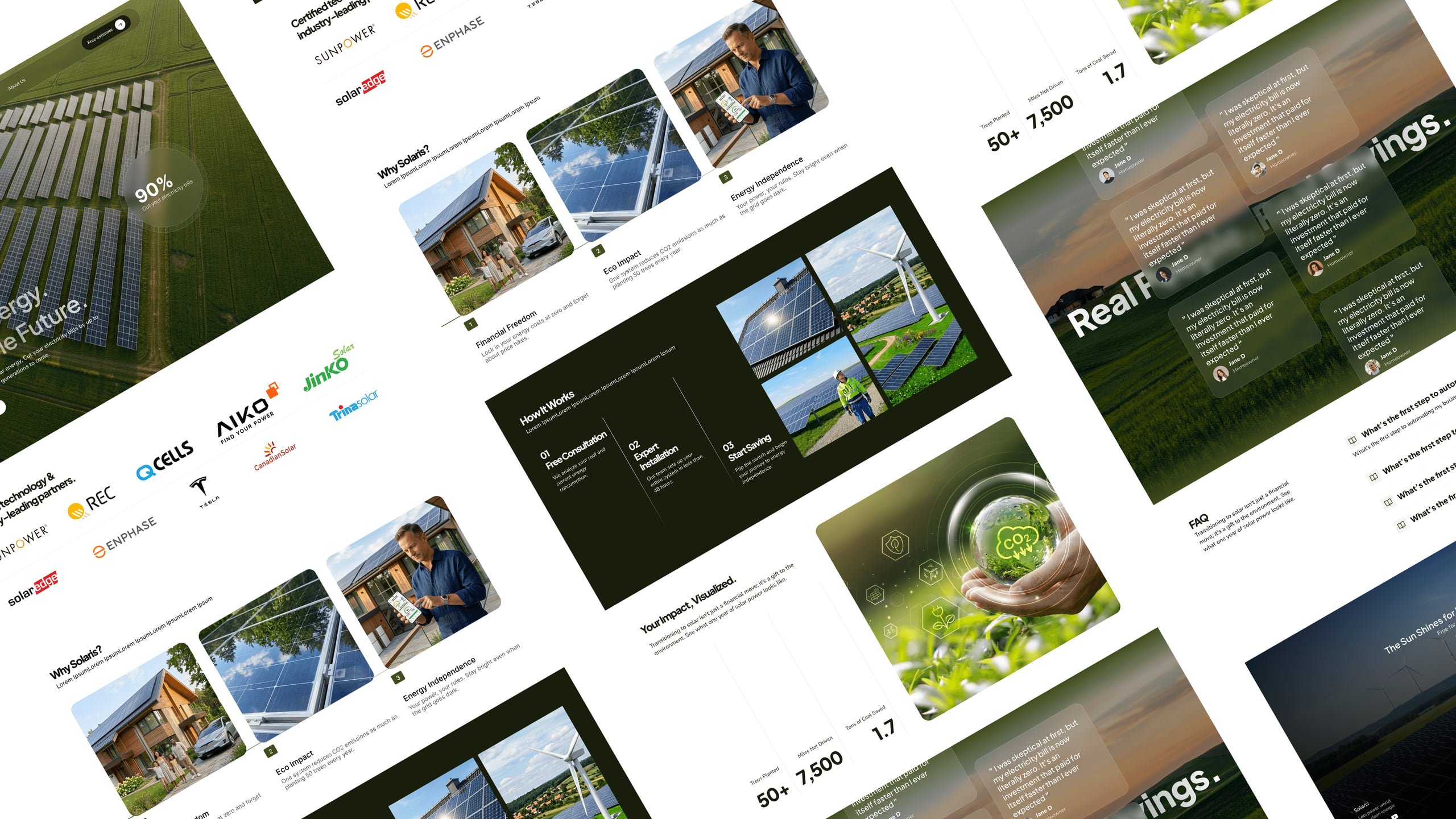
Going solar shouldn't feel complicated, so the page doesn't either.
The layout is clean and open, giving the content room to breathe and supporting the clean-energy message before you read a word. A green and white palette keeps the eco story present without weighing it down, and bold data visualisations make savings and impact feel real, because numbers only convince people when they're easy to read at a glance.
The onboarding flow is designed to feel effortless. If someone arrives curious but unsure, by the time they reach the call to action the decision should already feel easy.
04
Key design decisions
- 04.1
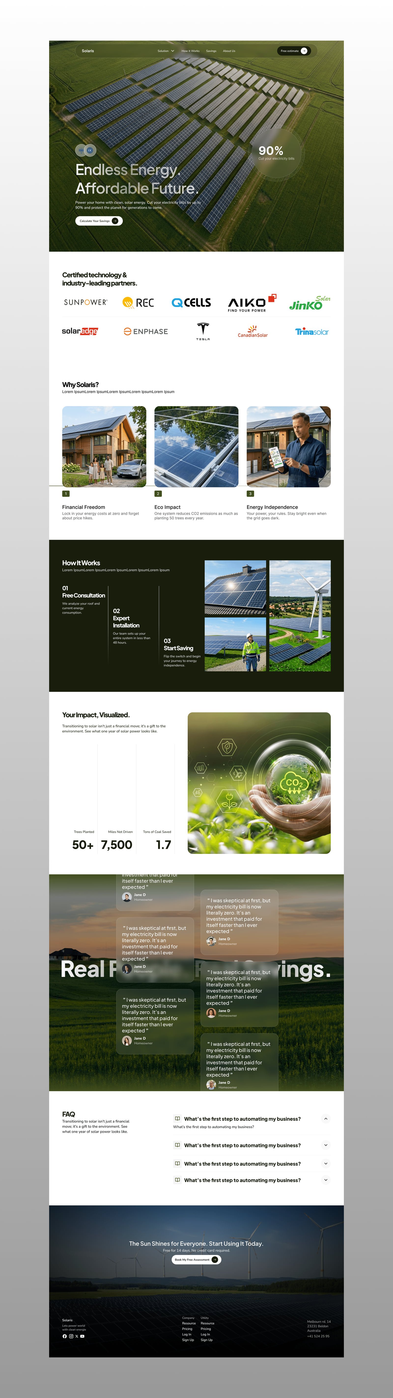
Layout and visual hierarchy
This is where I spent the most time. The page needed enough information to build trust, but not so much that it overwhelms. It took a lot of iteration, and every section had to earn its place.
- 04.2
Data visualisations that make value real
Sustainability is easy to claim. Showing someone exactly how much they could save, simply and visually, is what actually moves people to act.
- 04.3
The balance between green and white
Too much green and it feels like an environmental campaign, not a product. Too little and the eco story disappears. I kept refining until it landed somewhere modern, credible and clearly connected to the brand's values.