Luxury travel website
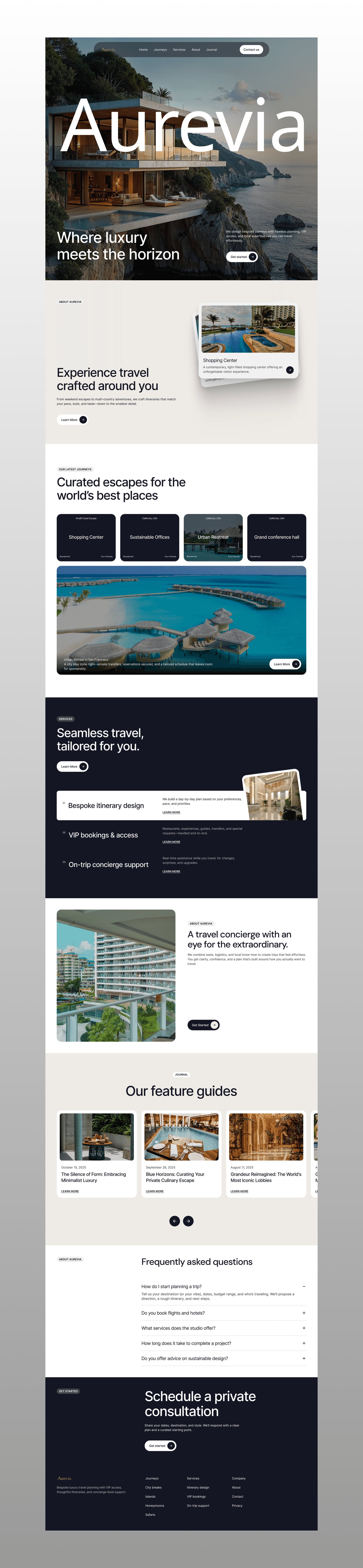
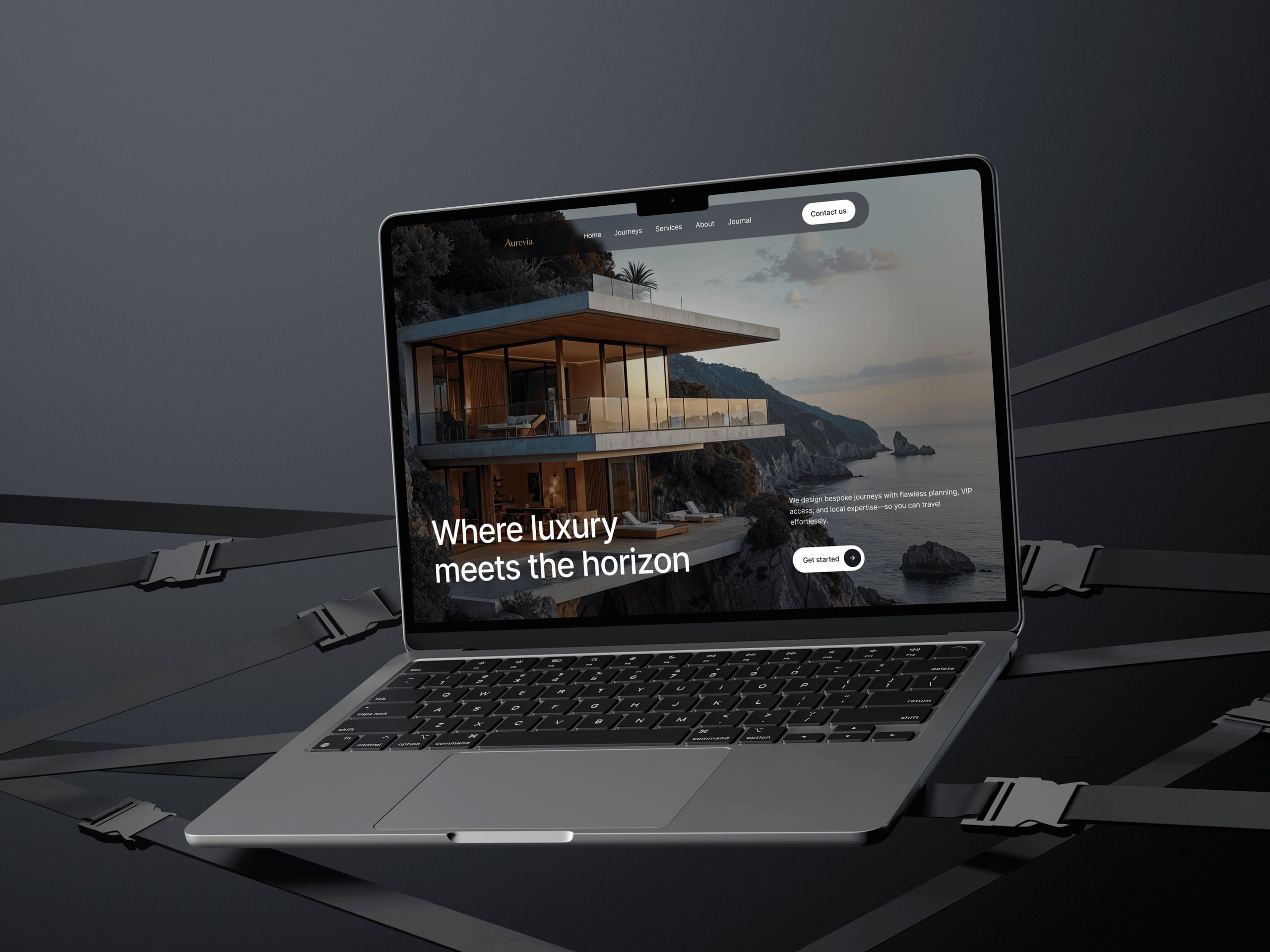
A landing page for a concept luxury travel brand, built to prove that design can feel beautiful first, not just functional.
- Client
- Personal project
- Role
- Web Designer
- Industry
- Luxury & Travel
- Platform
- Website
- Year
- 2026
- Status
- Concept
At a glance
Scope
- Art direction
- Landing page
- Destination pages
- Booking flow
Idea
Step away from dashboards and design something meant to feel beautiful first.
Problem
Luxury online usually means clichés: a nice photo and some gold. Real luxury is restraint.
Solution
Refined typography, a warm neutral palette and generous space that lets destinations speak.
01
The idea
Not every project needs a client brief. Sometimes you design something to push yourself into unfamiliar territory.
Aurevia was that project: a chance to step away from dashboards and data-heavy interfaces and explore luxury travel and high-end digital aesthetics. I wanted to prove, to myself and to anyone looking at my work, that I can design across different registers: not just functional SaaS tools, but experiences meant to feel beautiful first.
02
Challenge
Luxury is one of the hardest things to communicate through a screen.
Anyone can put a nice photo and a gold colour on a page and call it premium. Real luxury design is about restraint and confidence: making someone feel something the moment they land.
The challenge I set myself was to create a digital experience that feels genuinely exclusive and effortless, without relying on the obvious luxury clichés.
03
Solution
In true luxury, less always says more.
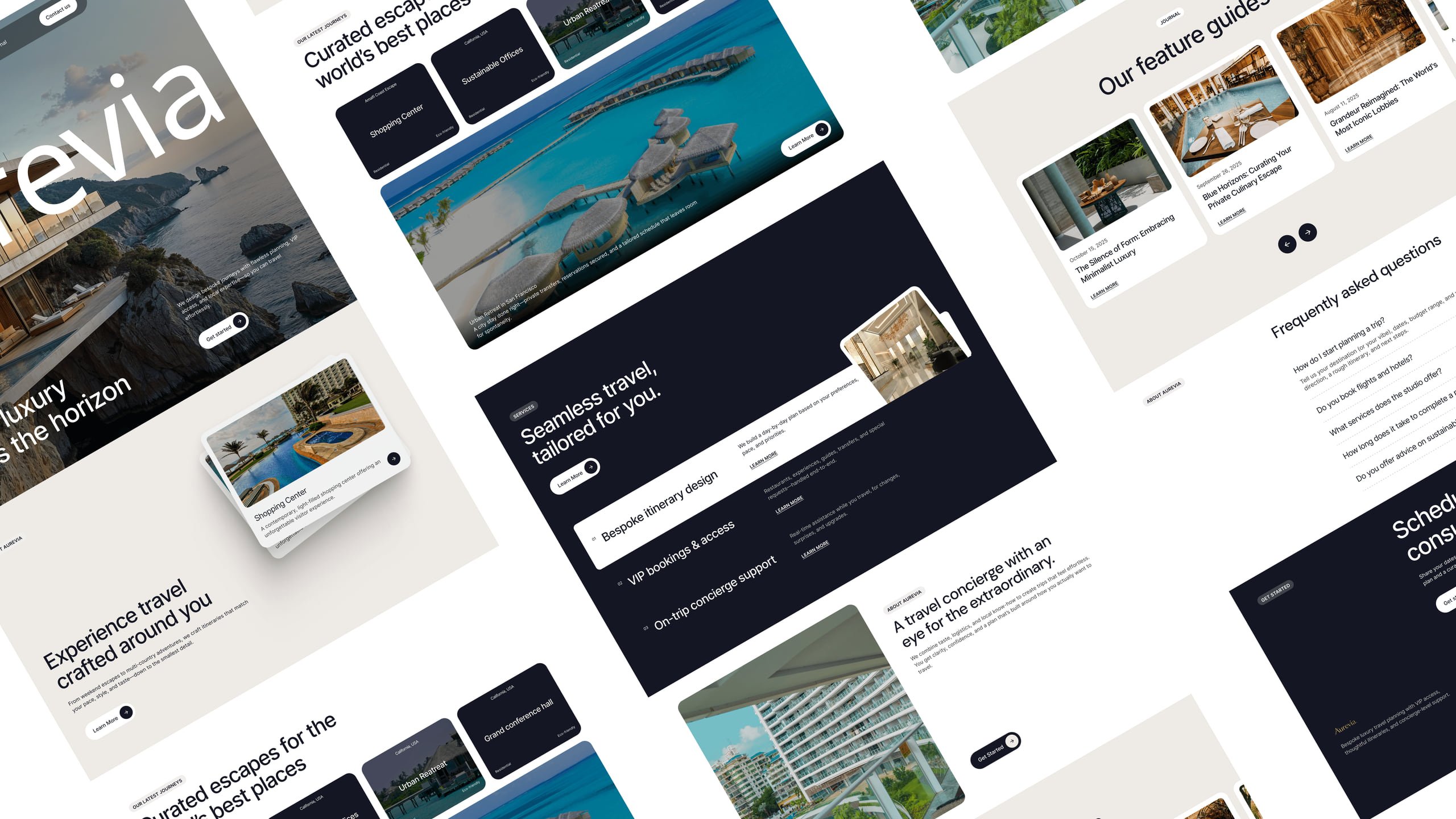
Aurevia is a concept brand built around curated, high-end journeys for discerning travellers. Refined typography does the heavy lifting, a warm neutral palette with gold accents sets the tone without overpowering it, and generous whitespace lets the destinations breathe and speak for themselves.
Minimal navigation keeps the focus on the visuals and the feeling. On a luxury travel site, browsing should already feel like part of the journey. I also designed pages beyond the landing page, testing how the aesthetic holds up from destination pages to the booking experience.