Construction management platform
BuildAxis brings projects, documents, finances, equipment and communication into one platform: a web app for managers in the office and a mobile app for crews on site, with AI taking over the repetitive paperwork.
- Client
- B2B SaaS client
- Role
- Product Designer, end to end
- Industry
- Construction
- Platform
- Web app, Mobile app
- Year
- 2026
- Status
- Delivered for development
At a glance
Scope
- User flows & IA
- Web & mobile UI
- Component library
- Developer handoff
Problem
Updates, approvals, defects and payments were scattered across spreadsheets, apps, email and paper.
Approach
One layered system: critical information first, detail on demand, for managers and field crews alike.
Delivered
A ready-to-build web app, mobile app and component library, handed over and going into production.
01
Challenge
Construction teams run on too many tools: spreadsheets, separate apps, long email threads and paper documents. Work slows down and blind spots appear.
Decisions get delayed because the right information is hard to find. Updates, approvals, defect reports and payment status get lost between tools. The result is poor communication between the field and the office, expensive rework, and projects that run over time and over budget.
02
Solution
BuildAxis replaces the patchwork with one clear system.
Instead of switching between apps all day, teams manage projects, documents, finances, equipment and communication in one place.
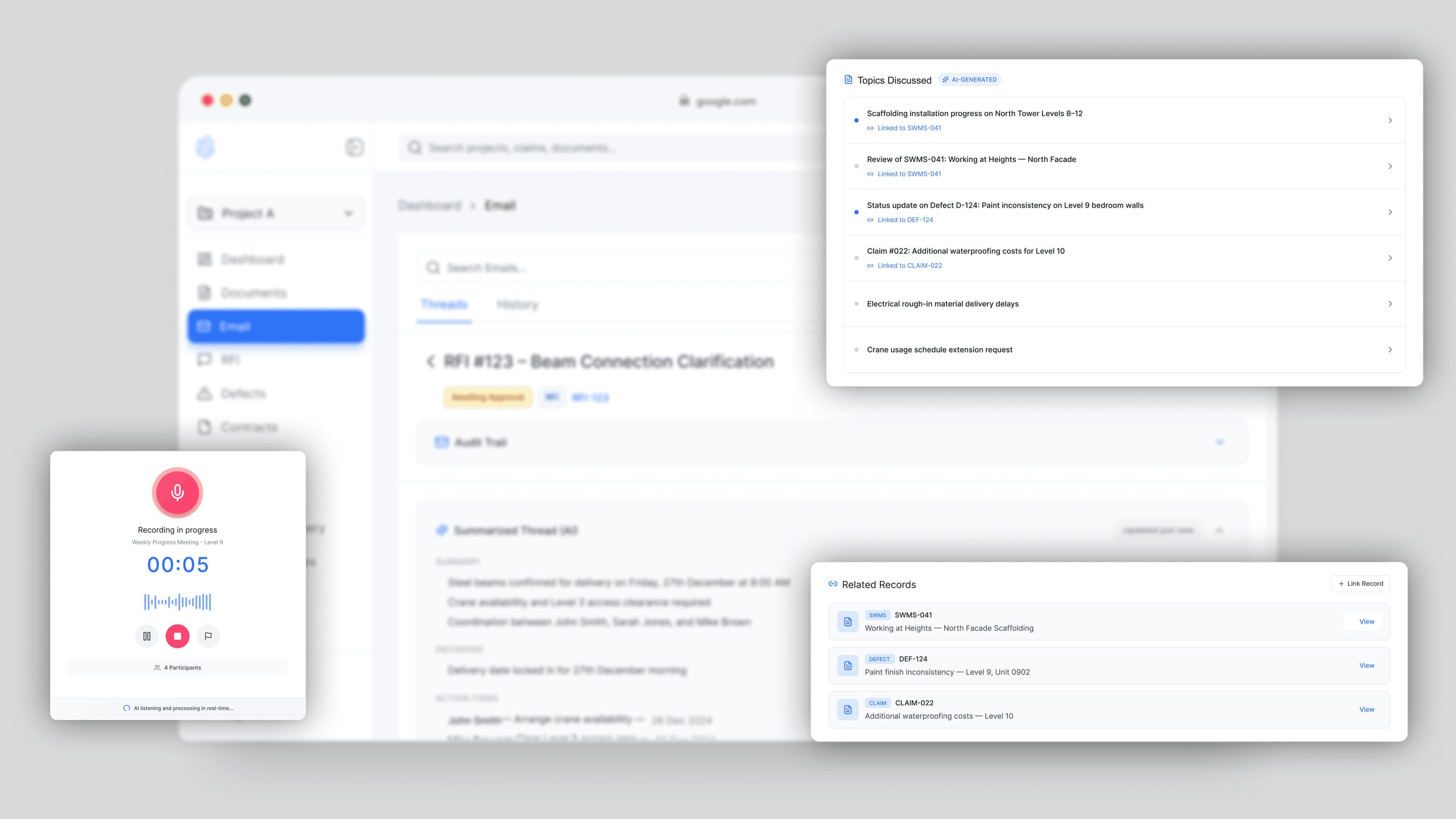
AI handles the repetitive daily work: drafting documents, processing payments, routing messages to the right people and tracking machines on site. Field teams can focus on building; managers can focus on the decisions that matter.
03
What I delivered
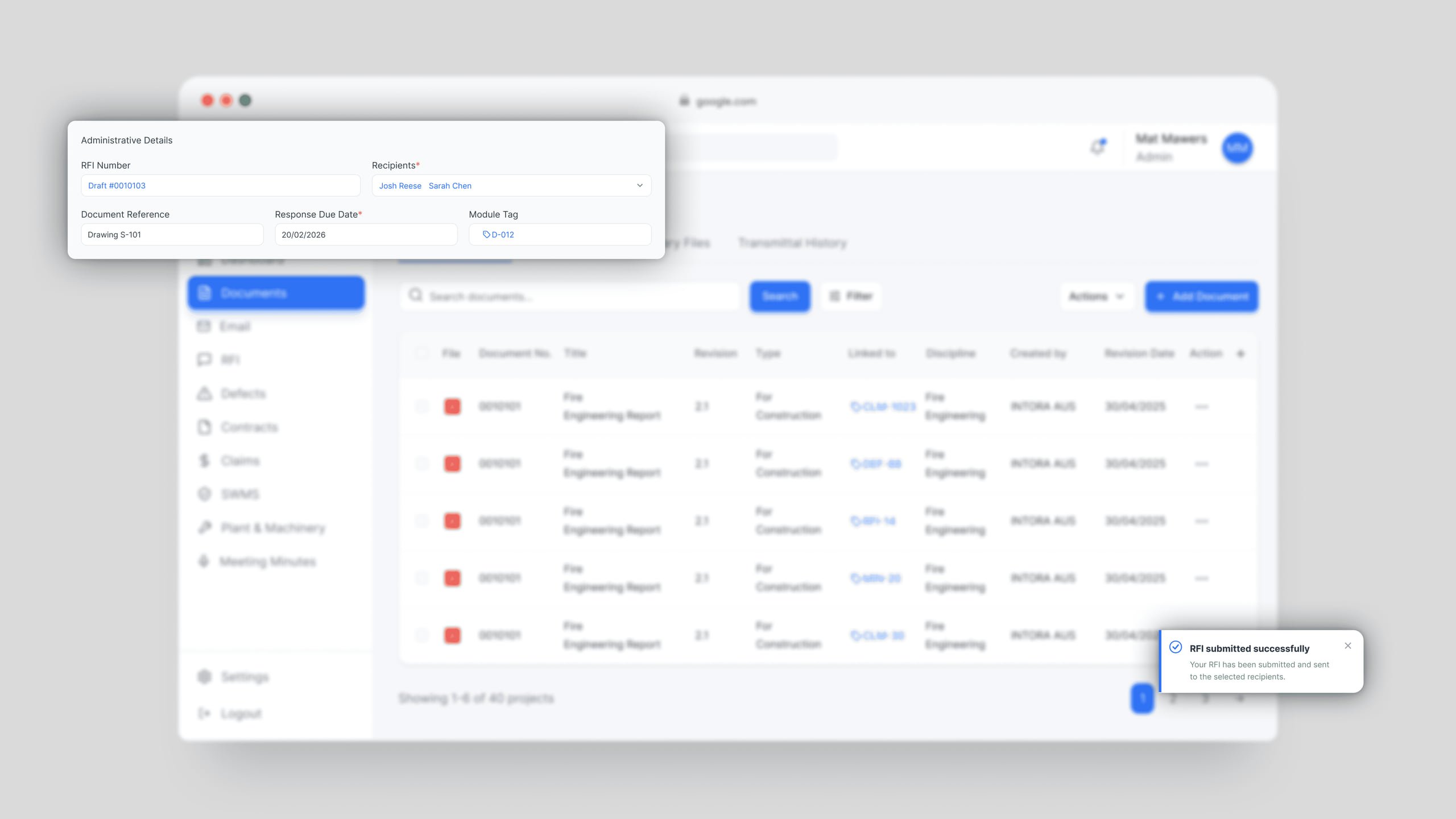
I designed the full platform, web and mobile, from the first user flows to a ready-to-build Figma handoff.
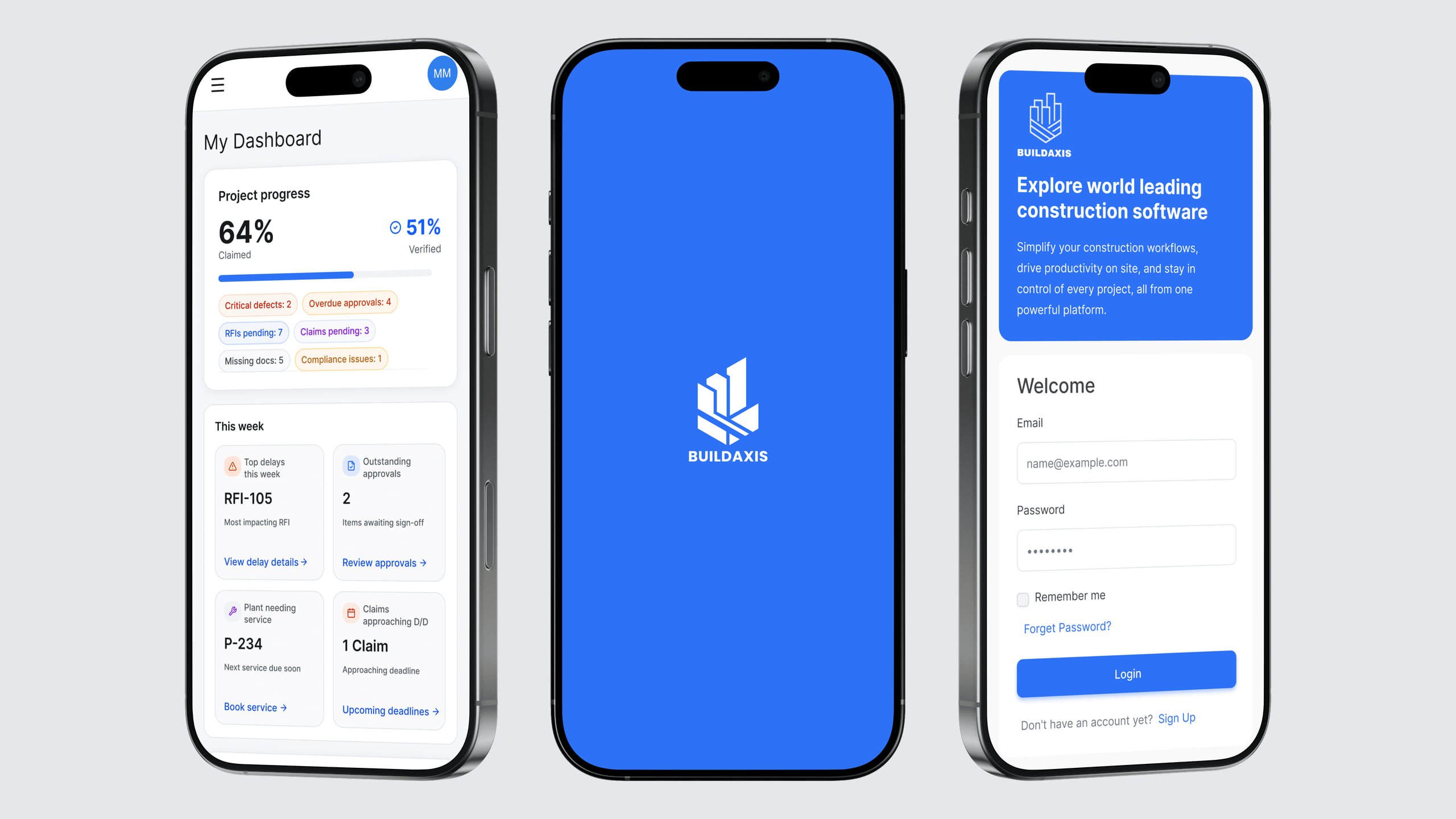
That covered the web app for managers in the office and the mobile app for workers on site, designed as one experience so moving between them feels familiar.
Every screen shipped with developer notes and a reusable component system, so the team could move from design to code without guesswork.
04
Key design decisions
- 04.1
One system for two very different users
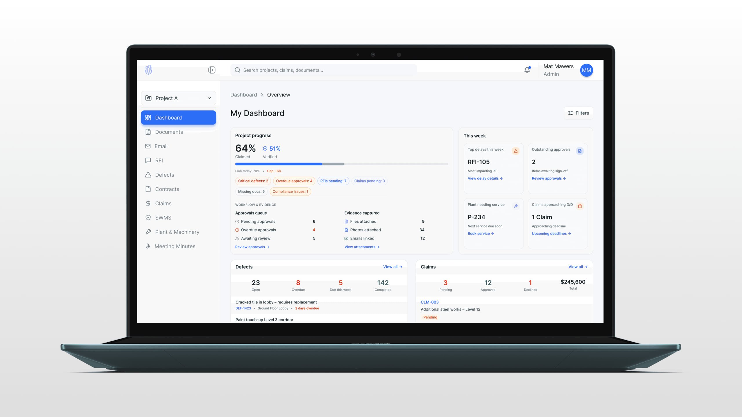
Managers need to see a lot at once: progress, approval queues, open claims and RFIs. Workers need the opposite: something simple and fast on a busy site. The answer was a layered structure: the dashboard leads with what matters most, and detail opens only when it's needed. Colour and status tags flag urgency without making screens noisy, and a modular component library lets new features land without breaking the design.
- 04.2
Making safety steps easy to finish
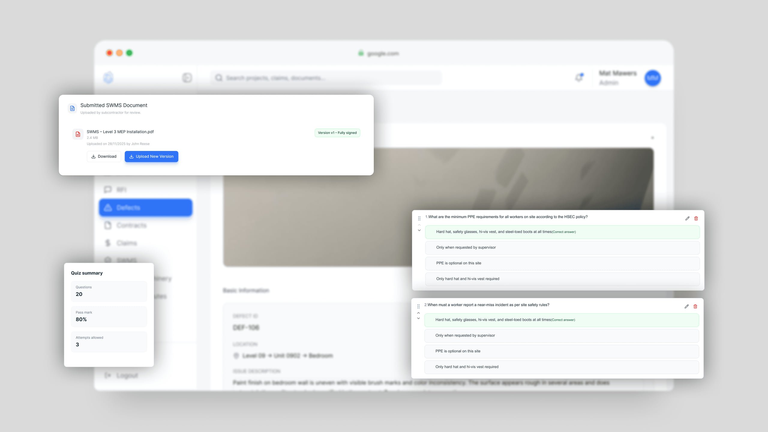
The first version of the safety induction was one long form, and workers gave up halfway through on their phones. I split it into short, clear steps with visible progress. Safety steps have to be completed, and the best way to get people to finish is to make the process feel easy.
- 04.3
Money calculations people can trust
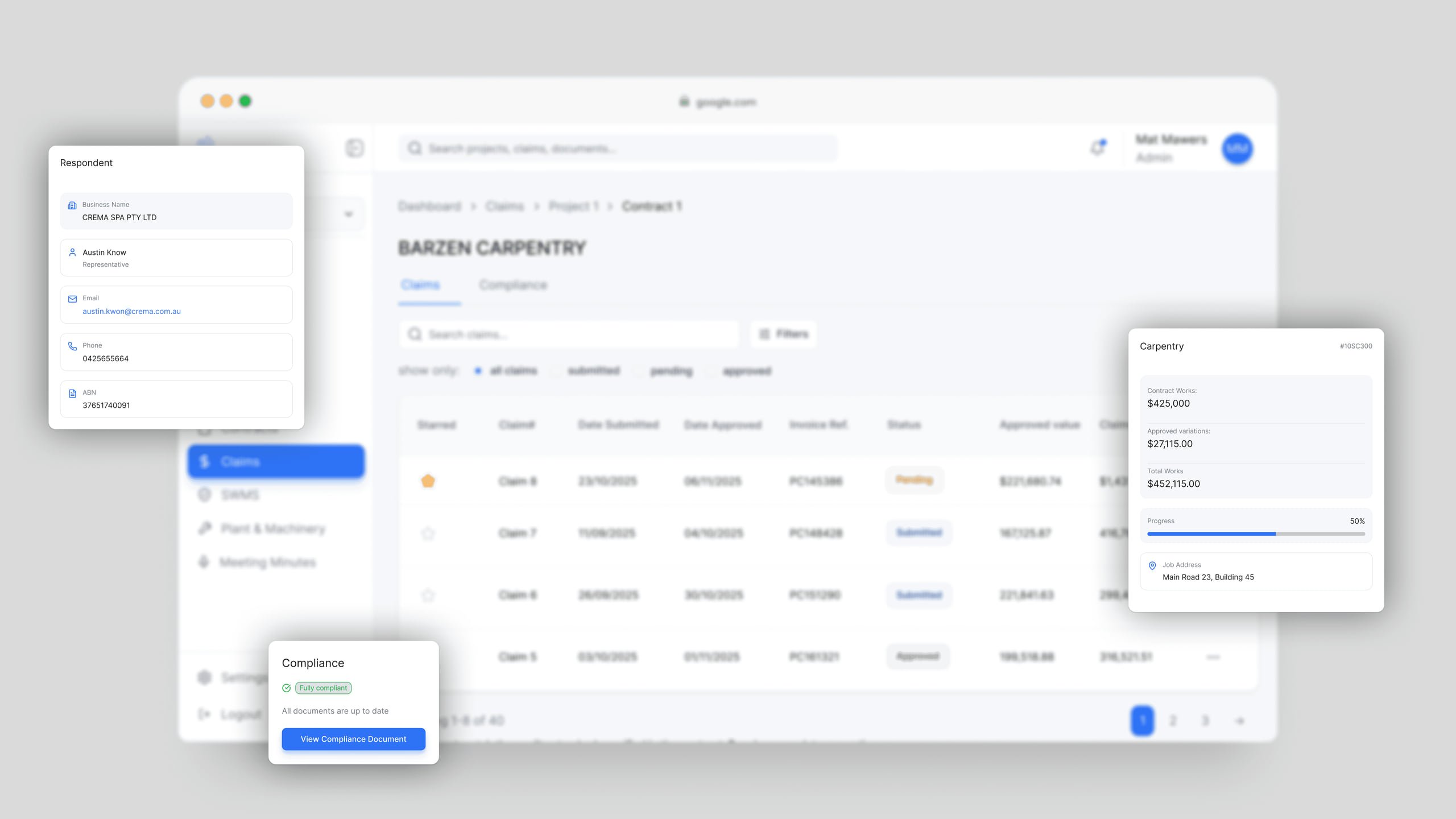
Claims & Contracts is where the money is handled, so it has to be right. I built the real contract logic into the interface. Work value, retention and amounts tied to the defects liability period are calculated automatically instead of by hand in spreadsheets. The challenge wasn't visual: it was making complex financial information readable and trustworthy for people who aren't accountants.
05
Current status
The platform is designed end to end and handed over: the web app, the mobile app and a component library the team builds from. It's going into production now.
What the design settles is the structure. Six separate tools are replaced by one system, documentation sits inside the workflow instead of beside it, and both apps share a single component library. Whether that shows up as fewer errors or faster onboarding is something only real use on site will tell, and that data doesn't exist yet.